Client product
Archive 3.0
A redesign of a client product that made new verticals shippable without layout debt. Navigation, page headers, and content areas can grow without a new frame each time.
Problem
The product had grown quickly. Features had piled up, pricing had changed more than once, and the team had run product-led experiments. Design and engineering were leaving inconsistencies and repeated work. Navigation and layout made a new vertical hard to ship.
Definition of success
The redesign started from a definition of success, so an idea could be judged against the product problems.
- Make it easy to add three new product verticals.
- Create a layout that can hold later expansion.
- Establish design processes that keep verticals consistent.
- Make core elements, such as page headers and filters, reusable for later experiments.
A layout that can expand
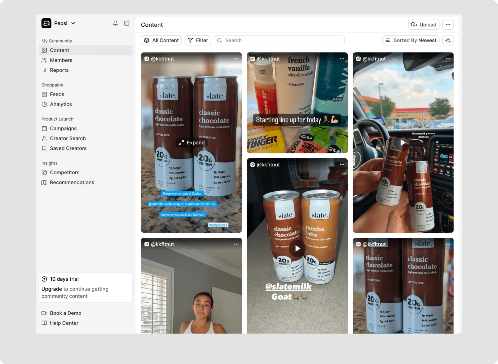
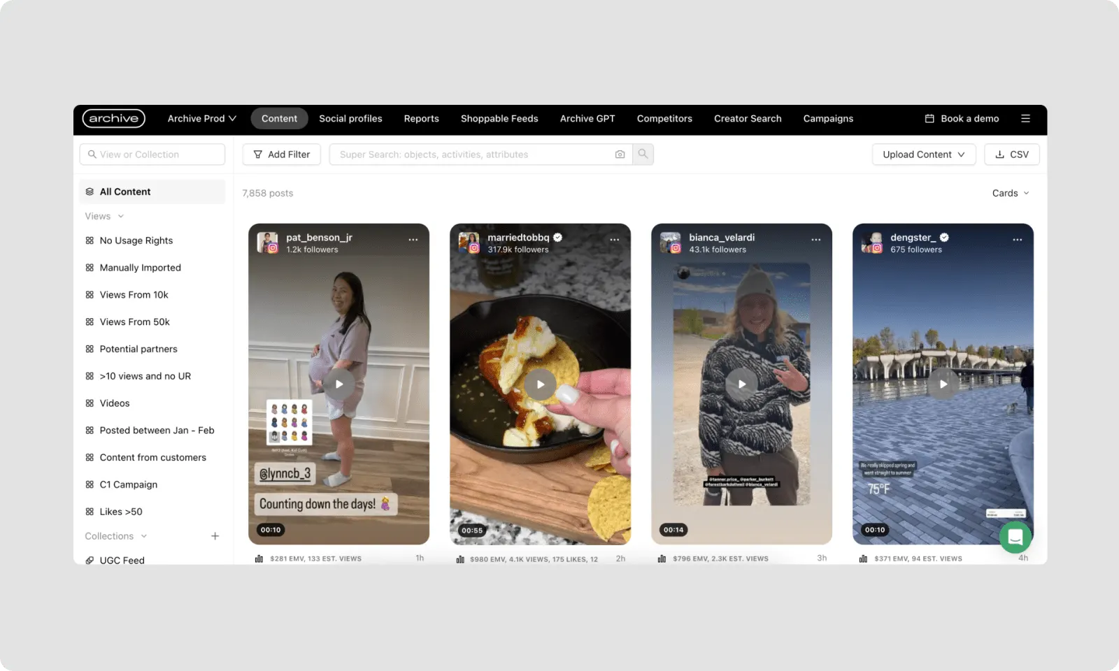
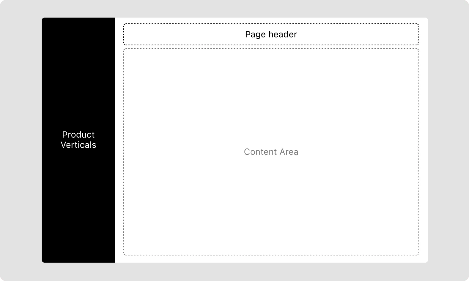
The old navigation had filled up. Usage showed which areas mattered, and where the structure could simplify. The previous frame kept every destination in one top bar. The new structure gives product verticals a column of their own, a reusable page header, and a content area that can change without a new frame.
It could ship in steps. New navigation first, with existing pages left as they were. Then a reusable page header, used across the product. Then each content area, as shared components became available.
Home
The redesigned home puts that frame to work. Product areas live in the sidebar. The content area is a filterable grid of posts. The frame at the top of this page is that home.
My Community
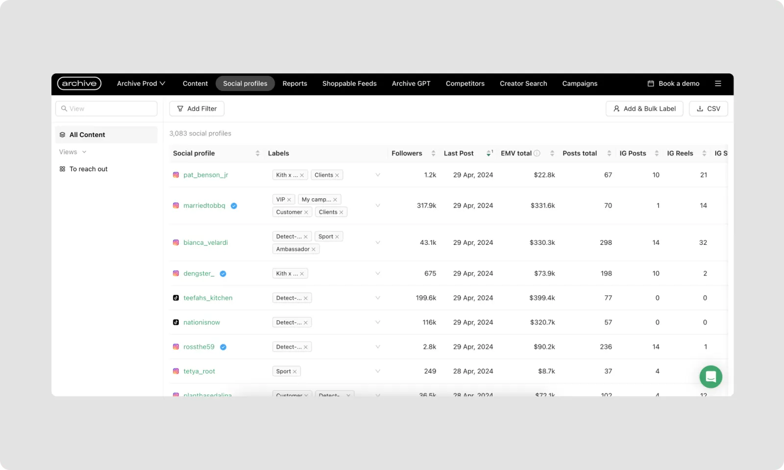
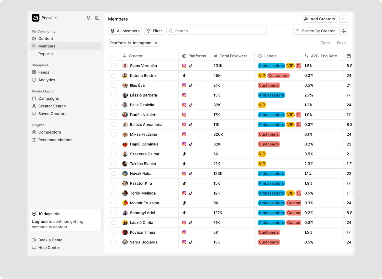
Creator data had outgrown a table of single social profiles. My Community became a members view. Each row holds a creator’s platforms, reach, and labels, which is the base for filters and later workflows.
Reports
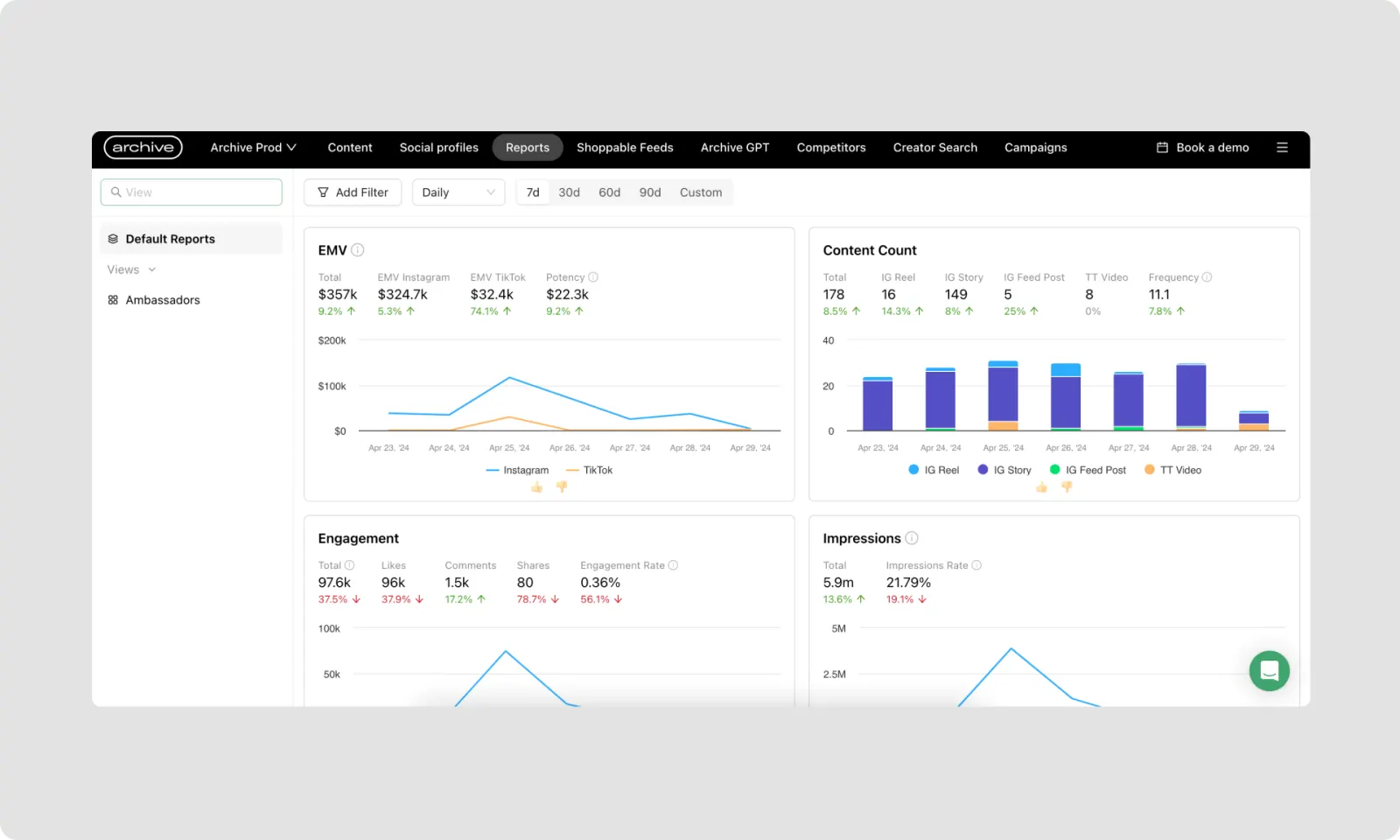
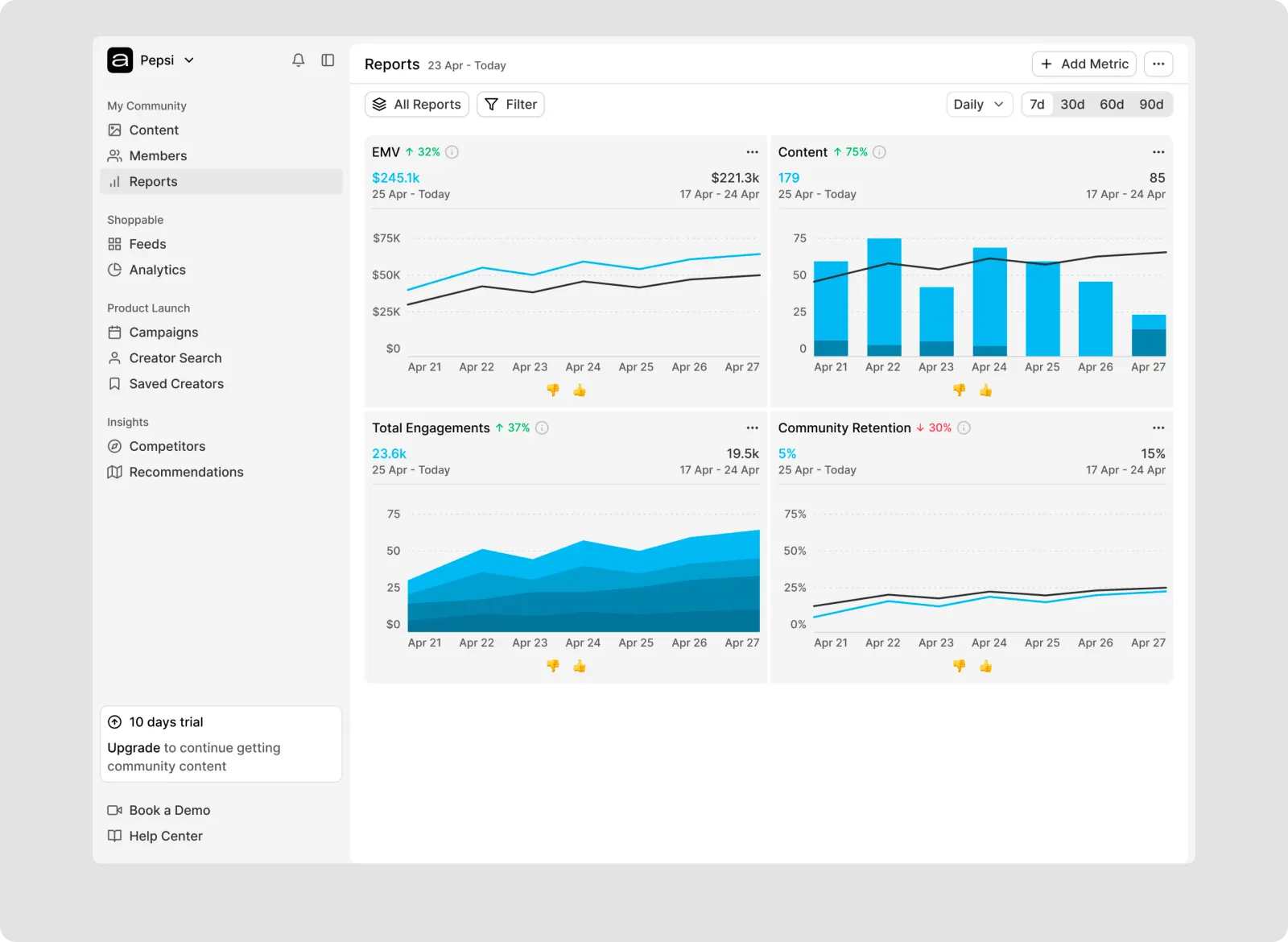
More metrics had made Reports a wall of charts. The redesign puts a small set of summaries first and lets a customer add the rest. Saved views keep a report for a campaign or a report type.
What the work left in place
A redesign changes habits people already have, often without one new feature to point at. Naming the problem and the definition of success kept the work judgeable.
- Engineering and other partners were in the design system from the start.
- Product issues sat inside the scope, so an idea could be judged against them.
- Inconsistencies were audited, and reusable components came first.
- Light design-system habits were set before duplicated build and support work could grow.
- Market and customer research continues as the product expands.